Blog: What’s it called? … Cumbernauld.
Architect: Geoffrey Copcutt
Completed: 1963
What’s it called?… Cumbernauld.
A slogan from a 1980s advert to promote the new town of Cumbernauld and encourage families to relocate there, to alleviate Glasgow’s housing problem.
This Blog will explore how “Britain’s most hated building”, The Cumbernauld town centre, represents an idea and concept of community living; how it fell short of that idea including the many influences that worked against the scheme that were not related to its design.
It was planned that Cumbernauld would not only look different, but it would also be different from other towns with every amenity centring on the centre itself. It would embrace this idea by having the town’s leisure, social and business facilities all under the same roof. It was to stretch for a half mile, housing shops offices, a college, entertainment and sport facilities, as well as penthouses.
Being designed in the 1950s and what turned out to be recognised as a megastructure, which basically describes an immense endlessly extendable, multi-storeyed structure, that brings together activities and land uses that are desired to be integrated into a single framework. Few concepts of a similar idea were constructed, for architects and planners alike the idea was something of excitement particularly during the 1960s. As one of the few concepts that ever made it to construction, the town centre comes under scrutiny, not only for what it stands for as that period of architecture but for its history played in the formation of new British towns.
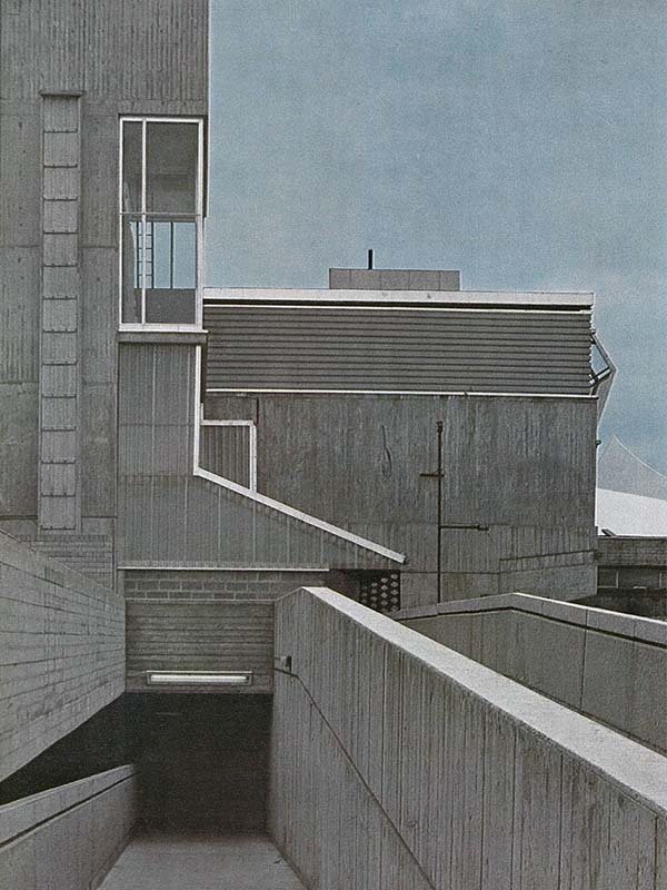
However nowadays the town centre is seen by the people as something that needs to be covered up; its Cumbernauld’s shame and deciding to have it painted over blue was somehow going to help, but in reality it only made things worse. People have come to see the megastructure as an ugly concrete protrusion jutting out of a clunky mess of buildings, yet if constructed as it was intended, it is something pretty special.
The planned relationship with the town, had it been built to the original scale roughly five times bigger than now, would have been the central or focal point even for all the settlements nearby; easily seen and reached from all new town homes. Inside the centre the architect and designers hoped all leisure, civic and retail needs would be met, it was hoped to be a new way of doing things in the absence of traditional streets and squares, it was even compared to Leonardo da Vinci’s vision of what a town or city might look like in the future.
When it was first constructed Architectural critic Wolf von Eckardt wrote “Leonardo da Vinci, nearly five hundred years ago, envisioned a city where all the vehicles move underground, leaving man to move freely in the sun. Leonardo might also have sketched Cumbernauld’s town centre, a soaring citadel surrounded by meadow.”
That was said in 1965, and hearing that now you might question what they were thinking, but I suppose looking back and even now there is beauty in the brutalist style, it divides opinions as people either love it or hate it, but there is something about the imposing expression of the raw material, monolithic and bold that people fail to see, the honesty of the building, it is what it is and with this being missed covering the town centre up only takes away from what it stands for.


